Chorsee & Interactive Widgets: The Perfect Pair for Simplified Chore Tracking
Apple’s forthcoming iOS release brings an exciting new feature: Interactive Widgets. While the feature is slated for release sometime in September, we are prepared to maximize its potential.
Widgets have always found a special place in the Chorsee ecosystem. An impressive 15% of our daily active users are already integrating at least one widget - a figure that stands out among similar apps.
But why are widgets and Chorsee such a perfect match? It’s all about accessibility and personalization. Parents appreciate the convenience of a quick glance at the household chore status, ensuring nothing slips through the cracks. Simultaneously, kids delight in tracking their allowances and adorning their home screens - a fun twist to chore management.
So, as we anticipate the new iOS release, we’re excited about the opportunities interactive widgets will bring. Welcome to the future of chore tracking – made even better with Chorsee and enhanced by interactive widgets, coming this September.
Stats
As we shared in a previous post, Chorsee expanded its feature set last fall to include both home screen and lock screen widgets. With a choice of 5 home screen and 6 lock screen widgets currently available, Chorsee offers an unparalleled level of customization to suit each user’s unique needs.
This flexibility has truly resonated with our users. In the last 30 days alone, we’ve seen an astounding 175 different combinations of Chorsee widgets being configured. This diversity highlights how our users are tailoring their Chorsee experience to fit their individual and family needs.
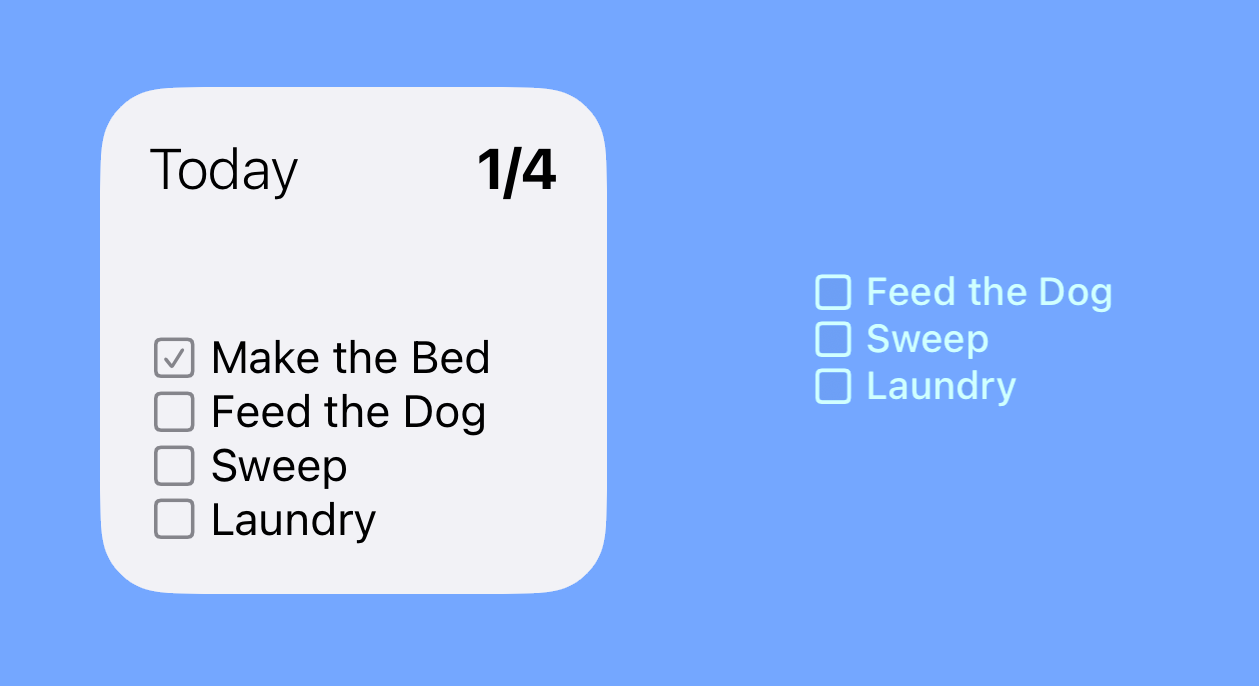
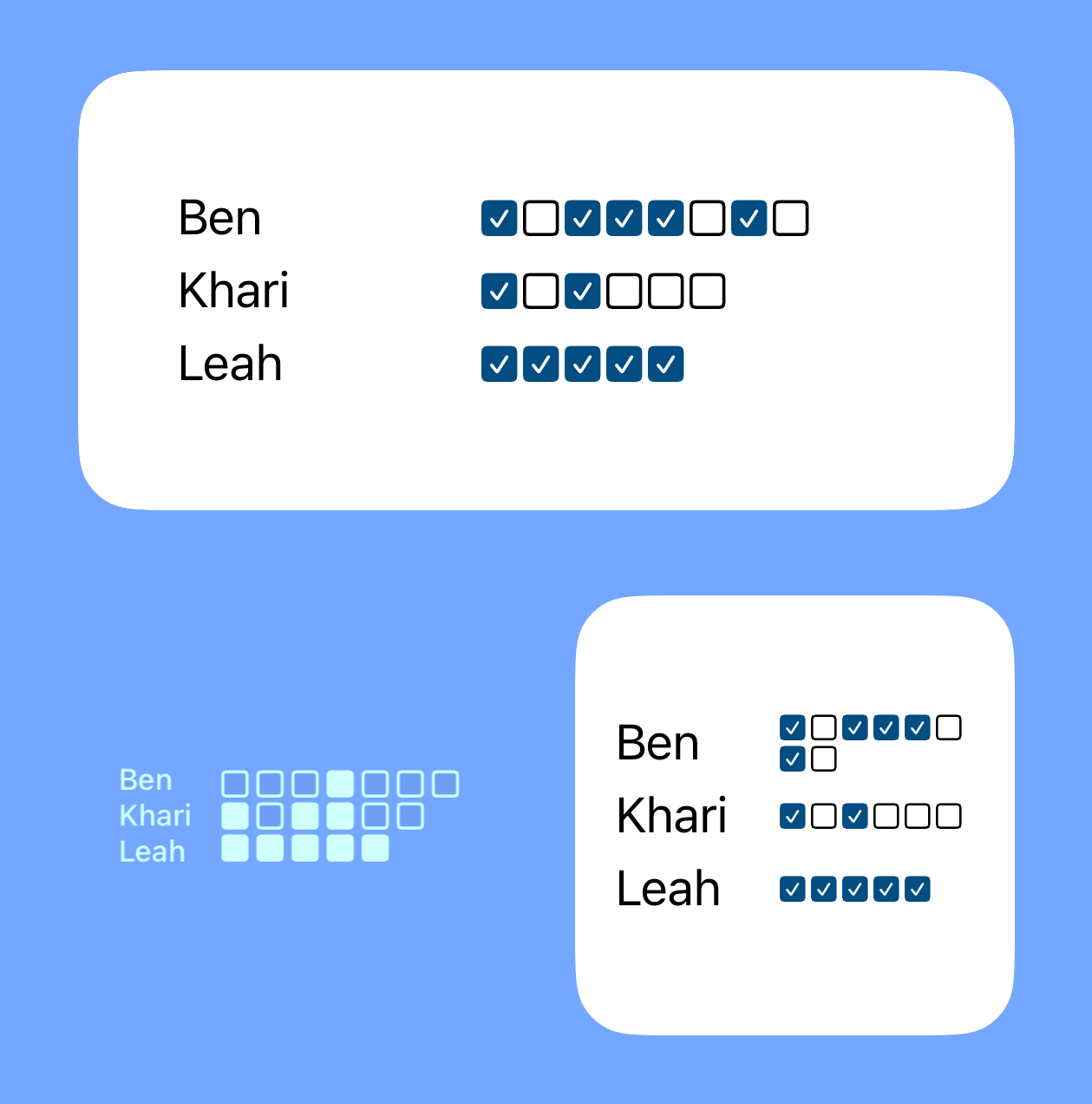
Among the available options, the “DailyText” widget is the clear favorite. It holds a place of pride on the home screens of 28% of our widget-enabled users, serving as a quick reference for one person’s daily tasks. Following closely, the DailyHousehold widget, which provides an overview of the entire household, graces 9% of user home screens. See belong for screenshots of both.
These stats provide a fascinating snapshot of how Chorsee’s users are leveraging our widget functionality to make chores a more manageable and personalized part of their day.
DailyText

DailyHousehold

Widgets for Everyone: A Look at Chorsee’s User Customizations
In assessing our widget usage, I was prepared to phase out any underutilized options. To my delight, it turns out that every widget has found its place in our users’ routines. The distribution of widget configurations is surprisingly balanced, reflecting the diversity of our user base and their varying needs.
Below, a pie chart vividly illustrates this equitable spread. Each slice represents a unique combination of configured widgets, as extracted via the WidgetCenter.shared.getCurrentConfigurations API. This chart is a testament to the breadth of customization Chorsee offers and how our users are tailoring the app to fit their individual preferences.

Enhancing Chore Tracking with Interactive Widgets
At Chorsee, we’re committed to constantly improving our app, making it more useful and enjoyable for our users. The upcoming interactive widgets present a fantastic opportunity for us to do just that.
We’re starting with the DailyText widget, a user favorite. We’re not only enabling interactivity, but we’re also giving it a design refresh to make it more visually appealing. Plus, for those who like a bigger view, we’re increasing the widget size options to accommodate larger display preferences.
But why just read about it when you can see it for yourself? Below, you’ll find an animated preview of the enhanced DailyText widget. Take a sneak peek at the direction we’re heading in and see how Chorsee is adapting to the exciting world of interactive widgets!

Now Available
As of September 14th, these changes are now available on the app store (provided you’re running the new iOS).
